Obviously I will have to consider each target audience when designing the calendar - it must be easy to understand by both children and the older audiences that the museum already has.
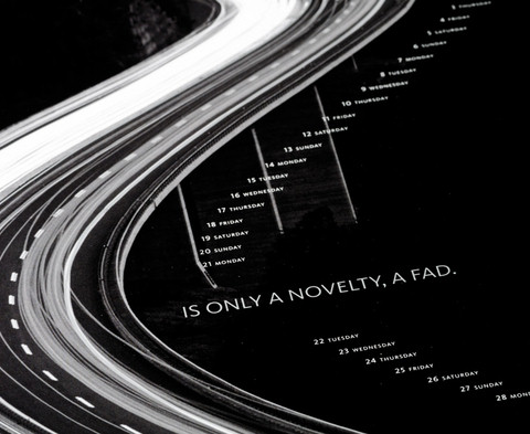
Calendar by Sander Tielen of Studio Kluif
A really technical/digital approach to this calendar, the use of simple numerals means that this calendar can be understood internationally.

Circular Formats
Interesting formats but potentially quite difficult to understand as it relies on small scale type.

Square Format
The use of squares could be echoed through the Pitt Rivers design as well as the format - the large and familiar shape of this calendar makes it easy to understand and allows people to absorb a fairly large amount of information easily.

Publication - Manuel Dall'olio
The calendar can easily be incorporated into a publication or book format for visitors to take away. This actual design of the calendar is interesting as well - the format is original as well as easy to make sense of. I'm obviously dubious about being too experimental with a calendar, as it's main objective it to convey information quickly and simply.


No comments:
Post a Comment