Friday 29 April 2011

Brief 5 - Lacuna Inc. Logo Amendments

Another direction for this logo, shout out to Will Asken for the suggestion! The blur could also work as an animation, increasing the potential for digital deliverables.

Brief 5 - Lacuna Inc. Logo Finalisation

Quite like how this has turned out - just a case of fine tuning some bits now. I want to reflect the nature of the company through negative space so that will play a key role in this brand - also, I like the idea of using a gradient fade out somewhere, as this again relates back to the idea of forgetting something.

Development


 Final Logo?

Brief 5 - Lacuna Inc. Packaging Research

Chris Triviaz - PHILAB

packaging for a range of expensive cosmetics - the design makes the brand seem like it has scientific grounding - where as cosmetics do not necessarily have to be scientifically approved. This is a technique I will definitely use for my Lacuna project.


Almo Office - Company

A range of office supplies by the studio Company, I particularly like the simplistic pattern and approach to typography here - though it's for printer toner cartridges, there is a clinical feeling to the general design.


Hellenic Sonic Airlines - Company

Again a really clinical approach to a brand that is not connected to medicine at all. I love the use of pattern and shapes here to create something incredibly simplistic and clear.

Brief 4 - Steve Edge Evaluation

This brief has been my favourite so far. Steve has been a fantastic client - but I also think this is a reflection of my lessons learnt from previous briefs. Instead of letting the client drive me I have god ahead and produced work quickly - giving the client a selections of choices along the way, and taking on board his own ideas without them having a negative effect on my work. I have come away with a great portfolio piece, as well as a great experience.

Steve was also a pleasure to work with because of his own personal investment, as well as my own, in the project. This great to have such a personal involvement and passion for a project - and this has helped me discover something about myself and the kind of work that I enjoy most.

The project as a whole has been good fun, but in hindsight I would like to have produced more finalised work and a better range of deliverables.

Thursday 28 April 2011

Brief 5 - Lacuna Inc initial concepts

Taken from the film - Eternal Sunshine of the Spotless mind - The organisation Lacuna Inc specialise in memory alteration, specifically the removal of unwanted memories of past relationships or bereavements. I intend to brand and produce a range of stationery, promotional and digital media for the company. 


Lacuna - Definition
(lə-kyū') pronunciation
n., pl., -nae (-nē), or -nas.
  1. An empty space or a missing part; a gap: "self-centered in opinion, with curious lacunae of astounding ignorance" (Frank Norris).
  2. Anatomy. A cavity, space, or depression, especially in a bone, containing cartilage or bone cells.

So I started removing parts of the type...

Wednesday 27 April 2011

Brief 5 - Lacuna Inc. Medical packaging

Vintage packaging

Packaging by Garry Emery of Emery Vincent studios http://www.emerystudio.com/es_flash.htm
Love the simple colours and shapes, even though it have a vitange look - the design is relatively modern, something like this might work for the Lacuna brief.. I think the brand I'm working on needs another dimension to it, like a pattern or set format.


Modern Medical Packaging
I like these packages for the meaning behind the size, colour and width of the shapes involved. They each indicated strength of dose, type of medicine and the amount - but it could maybe have be executed a little better. Great idea though!

Brief 4 - Finalising stationery & CV

Steve Edge stationery update - I've had this done for a while now, only just had the funds to print it all on the stock I wanted and get it documented.

This is the stationery thus far - obviously it reflects the design choices I made whilst creating the CV. There are a few tweaks that I've noticed could be made now it's actually been printed, but overall I'm quite happy to take this to the crit next week.


Both variations of the CV have been printed on the same stock as the stationery - newsprint of various weights for it's obvious sustainable/recycled qualities. The publication I am still very happy with, this is still as of yet a mock up - just to test different stocks and gain peer feedback. The proper version will be printed as soon as possible.
The standard CV needs a little work as far as presentation is concerned. I designed the layout with the idea in mind that it would be stapled in the top left corner - I'm still happy with this method of binding, I just feel it needs some form of folder to package it properly... So that's the next thing on the list!

I hope to photograph these properly for my portfolio over the next week or so - so watch this space!


Brief 5 - Lacuna Inc. Research

Companies that exist in games and films


Tuesday 26 April 2011

Brief 3 - Pitt Rivers Calendar Development

Calendar development

Really happy with the calendars so far. The hardest part and something i always struggle with was deciding on a colour scheme - This was because I wanted the calendar to be divided into sections, as well as three of the key events of the year, and obviously all the colours have to work together.. Bit of a confusing system really. But I think I've cracked it.

The 4 colours below are the 4 colours that will be used in the entire branding of the museum - they also work as a gradient, which will be useful later on.

I've going to get rid of the black text and just have it the same colour as the stock. Below I have tried two stocks and intend to try a few more - one is a pale grey and the other just plain white.. I'll probably go with an off white stock as this will best reflect the aging nature of the museums artifacts.

I decided on the 4 colours below as I wanted the colour scheme to be vibrant enough to appeal to children, but retain the regal qualities that many of its older visitors have come to love.. I also think these colours reflect the gory nature of the objects in store.

Monday 25 April 2011

Brief 3 - Calendar Prototypes

So I decided to scrap the long format stuff for now. It's a really difficult format to work with anyway, and though it might work well for a calendar - it's just not practical for other publications and printed media... and I don't even want to think about how that could work across digital deliverables.


I've gone with my initial idea of a square format calendar - as it has far more potential for experimentation and is just generally a lot easier to handle (thinking of our vast and varied target audience here!).
The idea of a folding calendar touches on the interactive nature of the museum, and it means I can incorporate the square format whilst not being completely confined by it.

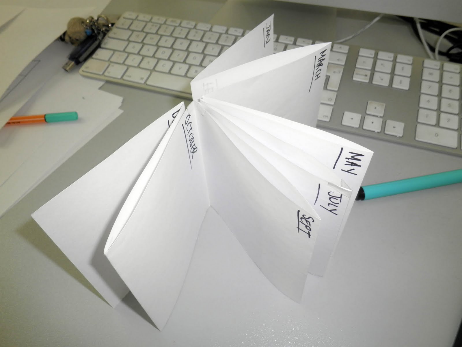
SINGLE SIDED CONCERTINA 
12 pages, each page 100mm x 100mm - makes for a pretty long calendar once unfolded (but it can be read like a book). The benefit of this is that it encourages the user to pin it up somewhere - and keep it for the whole year. The negative is that it is a little bulky, and will almost definitely be discarded if it is not pinned up.


DOUBLE SIDED CONCERTINA
The double sided concertina requires half the paper of it's larger brother, which is a huge benefit in itself - however, it is a lot harder to navigate, it's not so likely to be pinned up and there is just as much likely hood of it being discarded.
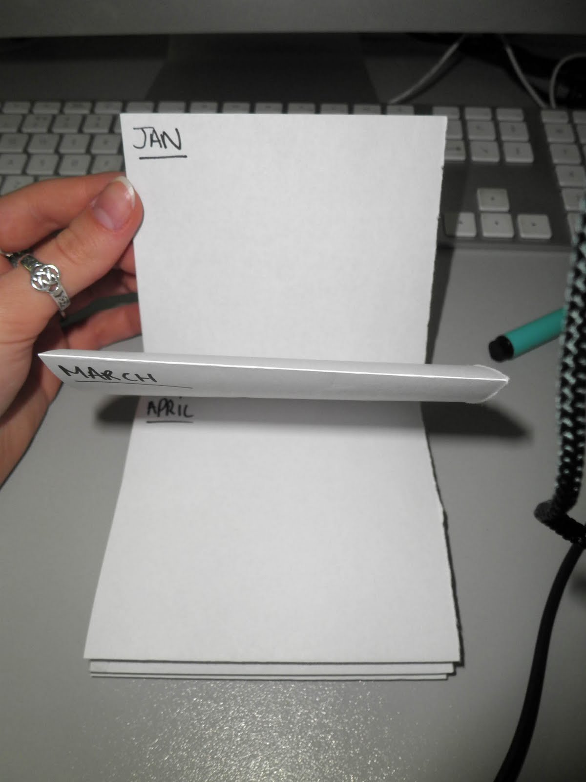


THE 'SWATCHBOOK'
This book discards the folding mechanism of the previous mock ups - and favours a more child friendly approach. It's incredibly easy to navigate and if printed on a thicker stock would be a tactile and useful item to hang on to. Also - there is the possibility of having the reverse side printed with alternative information... photographs, games for children or facts about the museum.