Front -

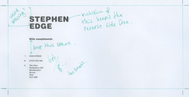


Going with the layout below for the compliment slip. It's been completely re-adjusted to fit the new format, but still echos the letterhead well.

Back -
I was going to go with something like this for the reverse of the compliment slip - but it just doesn't work with the type, and cheapens what is already quite an immature looking design. I'm going have either a blank reverse (given it's printed on sugar paper - should look okay) or something very small just to add a bit of interest.


No comments:
Post a Comment