"Corporate identity & branding with emphasis on concept, application, proposals & delivery of ideas to client."
I wrote this position statement back at the start of the year, and for the most part it still stands. I was not so much interested in a specific area of deliverables, rather a broader spectrum of design that focused on the client / designer relationship - the delivery of ideas. This gave me plenty of scope to do what I wanted but still gave me a target to work towards so projects didn't become lost. Looking back I realise that I should have stuck to this more strictly - as some of my projects did start to flounder in places. I also think that perhaps it could be a little more specific in places and this is something I will review in future. Overall I think this position statement sets me up well to work with and for other people, not discounting any deliverable but instead focussing on how to get my ideas across in the best possible way.
The actual project work for this module has been below my usual standard. I think there have been some good briefs and great ideas, but they have been executed poorly and not exploited as thoroughly as they should be. This has been due to a general lack of enthusiasm that I think many of us have suffered and is only natural when coming to the end of such a demanding 3 years. Obviously this is no excuse for poor work, but I think explains why my projects have not been up to scratch.
If I could start again from the beginning of the year I would do the following things. I would have dropped the graphic novel brief earlier - and instead produced a range of promotional material and branding, as well as a marketing strategy as this was one of the clients needs. I would have spent more time on the Creative Milk Round brief in its early stages, as this could have been a great portfolio piece had the actual design been of better quality. I would have been more direct in approach to the KTP brief, as I let other things like budget get in the way of producing something to a good standard.
As a result of this I would have had more time at the beginning of the year to get a head start with my other briefs - as they suffered because of my late start.
Overall I'm a little disappointed with what I have produced, but the experience has been absolutely invaluable. I think more so than any other module this has been a time for learning from mistakes, and I now feel happy to leave the course knowing that I'm well equipped to deal with the many issues a designer faces on a daily basis. I do feel that my portfolio is lacking in a few areas however, and this is something I shall address in the coming weeks in the lead up to the end of year show. I'm disappointed with the quality of work, but it is clear to me why my standard have slumped, and exactly what I need to do in future to rectify this.
Friday 3 June 2011
Wednesday 25 May 2011
Design Context Books - The Making Of..
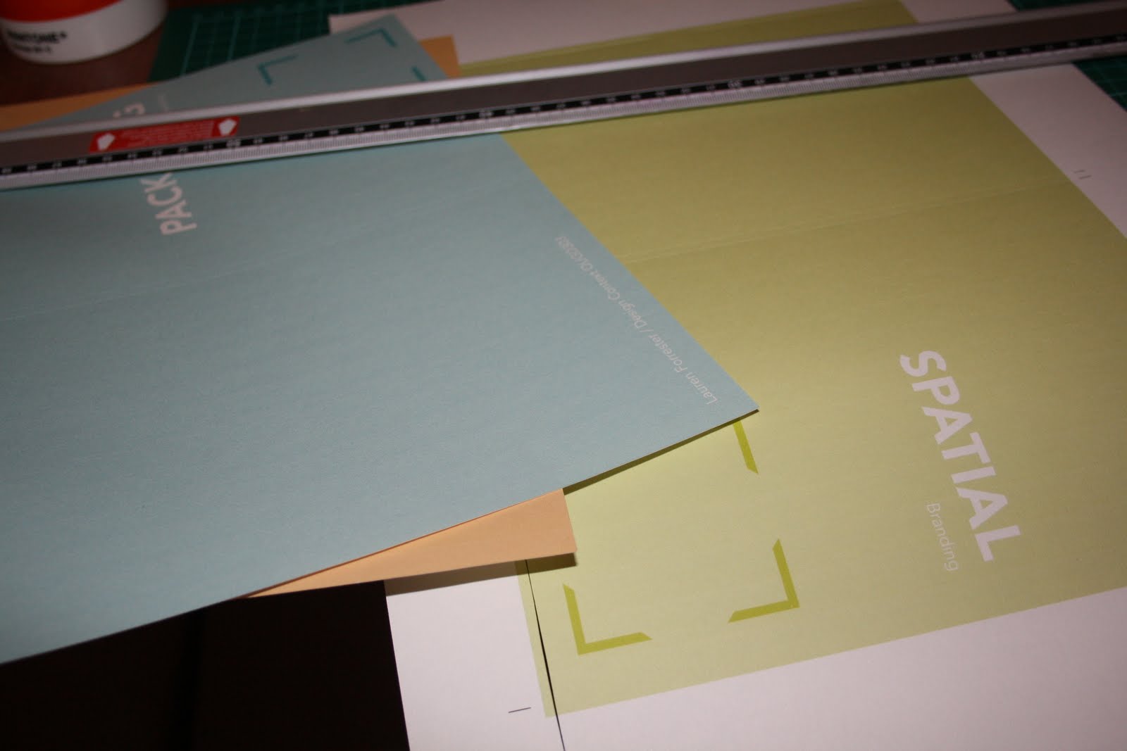
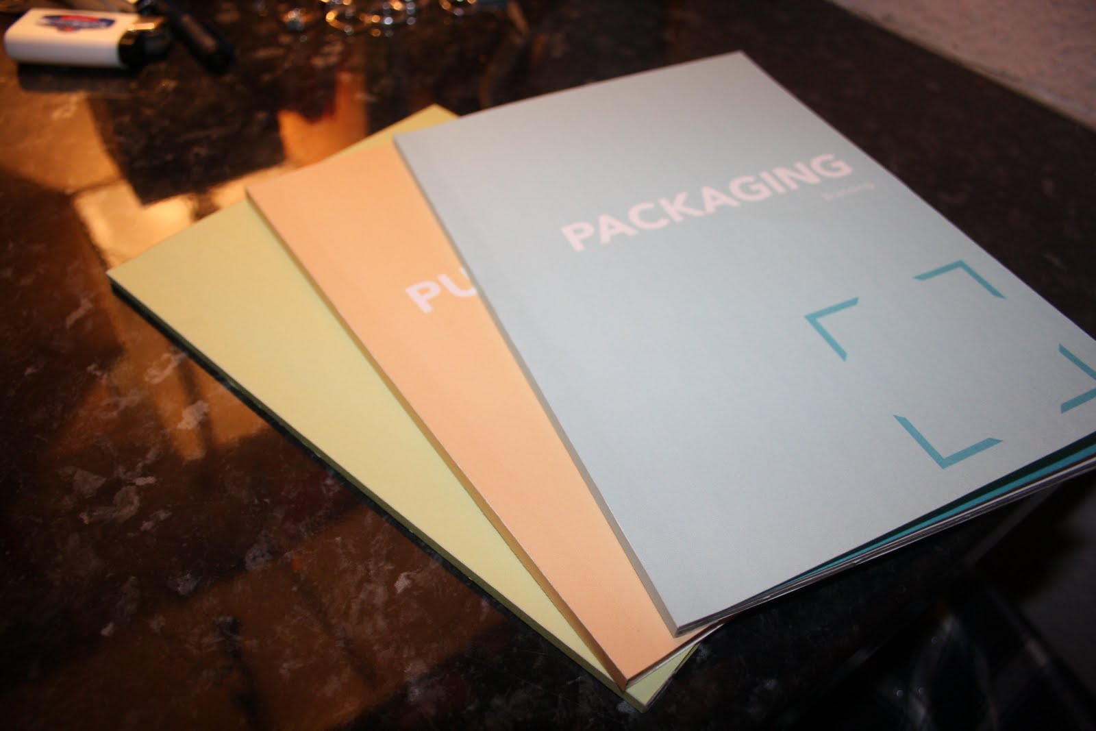
Will and I set up a bookbinding workshop in my room to bind both out context books in one fell swoop. The whole process went really well. I've learnt so much about book binding recently - and how to set up indesign documents for print - Which has been really useful as it's become apparent recently that I missed quite a lot when I didn't sign up for the print workshops last year.
I' really pleased with how these booklets turned out - though I'm a bit annoyed that I didnt find a reason to use either of my interviews from brand new or teabag studios.. Oh well!
In the end I decided to categorise these booklets by packaging, spatial and publication branding. My rationale states that I do not have a focus on any particular deliverable, and I realise that this may seem a little contradictory - however over the past few month I've realised that although I do not want to assign myself to any one particular outcome - these are the ones that hold the most interest for me, and the three of them together offer quite a broad perspective of the areas in which branding exists.


Friday 20 May 2011
Brief 3 - Pitt Rivers Evaluation
This project has been one of the better branding experiences I've had - though the range of deliverables was not what I originally had intended. I did want it to be more focused on promotional materials, however far more thought went into the branding than I initially intended, and so the overall focus fr the brief shifted slightly.
Conceptually -I think the branding is very appropriate, fitting with the two extra audiences I wanted to capture without alienating any of the existing museum goers. I did not manage to complete the full range of deliverables and if I could do it again I would spent just a little more time on this, and less time fine tuning the branding. However I think the branding exercise on the whole has been a useful experience, and makes me realise that I can still design around a good concept.
Conceptually -I think the branding is very appropriate, fitting with the two extra audiences I wanted to capture without alienating any of the existing museum goers. I did not manage to complete the full range of deliverables and if I could do it again I would spent just a little more time on this, and less time fine tuning the branding. However I think the branding exercise on the whole has been a useful experience, and makes me realise that I can still design around a good concept.
Wednesday 18 May 2011


Tuesday 17 May 2011
Brief 3 - Pitt Rivers 3D Environment
Some Photoshop mock ups of the museum signage and promo posters. I didn't want too much fuss around the main entrance, the name of the place was ll that's really necessary here, as the rest of the city's posters and signage would have all the events on them. I like the mystery that's created by having such minimal door signage, it creates excitement for the kids, and encourages people to come inside and discover rather than stand outside reading.


Monday 16 May 2011
Design Context Books - Mock Up Books
Still figuring out how I'm going to bind these three books - Easiest way is obviously as a booklet, but I'm not sure how big they're going to get - so perfect bound is obviously a consideration.. though I've never perfect bound a book so I'll have to do a practice run first!


Brief 3 - Pitt Rivers Posters
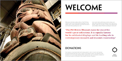
Some feedback I had today made me realise something really fundamental missing from the logo and branding so far - and that was a small explanation of what Pitt Rivers actually is. Surely if my problem is to attract a new audience, they have to be able to know what it is straight away!
These posters hopefully adress that issue - but I feel they need a little refining. Also, I'm not sure if I'm going to go with the blank mono variation, or the photo overlays as of yet - I like them both for different reasons! But the both resonate with the idea of uncovering or discovering something. Massive typo again! Oops!


These posters hopefully adress that issue - but I feel they need a little refining. Also, I'm not sure if I'm going to go with the blank mono variation, or the photo overlays as of yet - I like them both for different reasons! But the both resonate with the idea of uncovering or discovering something. Massive typo again! Oops!


Logo variations


Sunday 15 May 2011
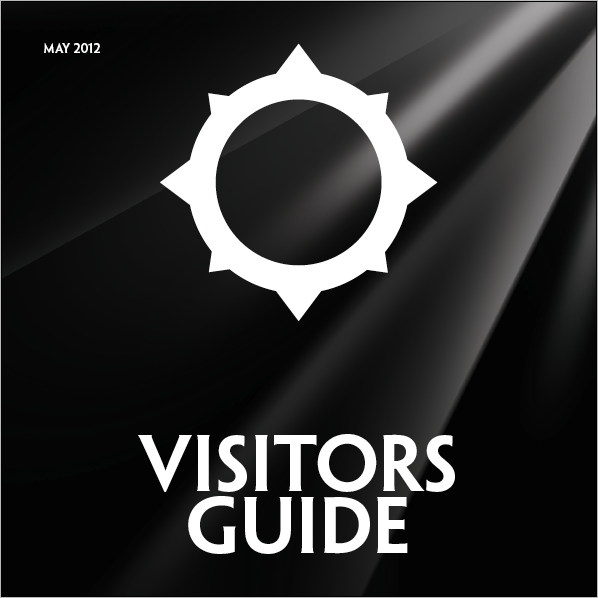
Brief 3 - Pitt Rivers Visitors guide
One of the most important deliverables in this brief is the monthly newsletter/visitors guide - It kind of encompases a little bit of everything, so doesn't serve a purpose as such - but because it's monthly update it helps place the museum in the fore front of peoples minds, otherwise it would fade into the background and be forgotten.
It's also just a bit of fun to read - whilst giving the museum an opportunity to plug it's up and coming events.. I'm going to sort out that missing apostrophe right now.


It's also just a bit of fun to read - whilst giving the museum an opportunity to plug it's up and coming events.. I'm going to sort out that missing apostrophe right now.


Subscribe to:
Posts (Atom)