Thursday, 31 March 2011
Design Context Book.
So this is the first time in a while I've had a proper think about how I'm going to categorise the design context book - I say book, but I'm ot even sure of that either!
The above are the resulting notes from the discussion, and I just thought I'd take a few minutes to write them up in a logical order, so myself and other people can actually understand what the hell i'm talking about.
Concept
- Branding, divided into what I see as the 4 main areas - Logo, Environmental, Range, Guidelines.
However I'm pretty certain these will change. Not happy about having logo on it's own, as there will no doubt be repetition through each category - This section will probably change to Print/Publication or something similar.
Content
- Each book will follow a similar structure - I need case studies, quotes, interviews and opinions of others to back up my own view. Each section will need an introduction, where I can state the purpose of the book/whatever it might be, as well as a practical 'how to' section, which will detail all the useful information I have gathered over the years - sizing, formats, colour palettes, finishes, stocks etc...
Format
- Should be driven by the content, I am however quite set on the idea of having a set of publications of some kind that can be read in any order. This means the set of books (or whatever!) will be interpreted differently depending on which order they are read, thus resulting in a fresh opinion or inspiration to go away with each time.
Considerations
- The format and design should reflect the content where possible.
- It must be easy to navigate and understand.
- Who is involved in this industry?
- Define branding/corporate identity.
- Propose questions, I don't have to answer everything.
- Define a target audience
- Include limitations, I cannot include everything on this topic.
Brief 4 - All stationery
None of these ranges are totally finished yet, but just to get an idea of the progress of each direction I thought I'd print them all out on the right stocks and in colour, as so far I've only been documenting the technical aspects.
Direction 1
I really like the stock and colour combination of this direction - however after a quantity of research I've found it to be completely inappropriate for the target audience. Far too informal and immature looking.
Direction 2
I was initially quite happy with this direction - feedback from the crit was that it was too corporate, and didn't accurately reflect Steve's involvement in the creative sector. I think there's a lot I can still use as far as layout is concerned, and plenty I can take away and develop further. It's also a good back up in case the client requires a more standardised design.
Direction 3
This is the direction I'm most happy with, as it's almost a mix of the two previous directions, taking the best bits and combining them.
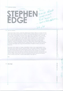
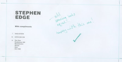
I printed this out with the intention of cropping it down, but after a while of looking at it realised that I quite like the crop marks, there's something about them that suggest technical accuracy and technical drawing. The practice of technical drawing is evident in both architectural and interior design, and it seems appropriate to use these technical elements as part of the brand.
The process of development I have utilised throughout this brief (of printing out and dissecting the grid) has also informed the direction I want to take this in. I've been using and experimenting with grid structures throughout the project, and to a certain extent the grids have a visually pleasing quality of their own. I'd like to incorporate suggestions and elements of the grid in the actual design - which links back really nicely to the idea of construction and technicality mentioned earlier.
Wednesday, 30 March 2011
Brief 4 - Direction 3, Compliment Slip.
Brief 4 - Direction 3, Letterhead.
Brief 2 - KTP - Evaluation
The first half of the year has got off to a slow start. The projects I'm working on are all live briefs and after a few tutorials I've realised a lot of my briefs don't allow me to full exploit my rationale. My desire to work with clients has given me a huge amount of experience in dealing with other people and finding a compromise between my own ideas and theirs - however this as left me with a compromised portfolio, and less time to do something about it. This brief in itself has been quite slow - and at first I wanted to blame things with the client, as there were problems with budget and the KTP package didn't end up going to print. There was also a lack of copy to put in the brochures, another reason I felt I couldn't carry on with the brief.
Looking back I realise it was my own fault I didn't resolve this brief quicker - Its my job as a designer to produce the work and it would have been very easy to take things into my own hands instead of letting other issues hold me back. This has been a very valuable lesson. You can't always waste for the client to tell you what they want - to a certain extent you just have to give them it.
Looking back I realise it was my own fault I didn't resolve this brief quicker - Its my job as a designer to produce the work and it would have been very easy to take things into my own hands instead of letting other issues hold me back. This has been a very valuable lesson. You can't always waste for the client to tell you what they want - to a certain extent you just have to give them it.
Tuesday, 29 March 2011
Brief 4 - Direction 2, Compliment Slip.
Compliment Slip layout development based on direction 2.
Development
Front
Happy with the layout below - didn't need as much tweaking as the previous compliment slip - the choices I'd made for the letterhead transitioned quite nicely into a new format.
Back
Development
Front
Happy with the layout below - didn't need as much tweaking as the previous compliment slip - the choices I'd made for the letterhead transitioned quite nicely into a new format.
Back
Brief 4 - Direction 2, Letterhead.
Letterhead layout development using direction 2, as part of Steve's range of stationary.
Development
Development
Going with the layout below. I divided the page into 3 sections so that the folds do not interfere with the text.
Brief 4 - Direction 1, Business Card.
Pending.
Brief 4 - Direction 1, Compliment Slip.
Compliment slip layout tests for the first design direction - made to mimic the letterhead as much as possible.
Front -
Front -
Going with the layout below for the compliment slip. It's been completely re-adjusted to fit the new format, but still echos the letterhead well.
Back -
I was going to go with something like this for the reverse of the compliment slip - but it just doesn't work with the type, and cheapens what is already quite an immature looking design. I'm going have either a blank reverse (given it's printed on sugar paper - should look okay) or something very small just to add a bit of interest.
Breif 4 - Direction 1, Letterhead.
Development and resolution for a letterhead based on the first design direction.
Development
Decided to go with the one below for a few reasons. I didn't really want to use the gradient for the logo heading, but I the only other choice was 50%K and that just left the whole thing feeling messy and unbalanced. I went for standard Helvetica for the copy as this still fits with the rounded version I initially used.
Subscribe to:
Comments (Atom)


