Chris Triviaz - PHILAB
packaging for a range of expensive cosmetics - the design makes the brand seem like it has scientific grounding - where as cosmetics do not necessarily have to be scientifically approved. This is a technique I will definitely use for my Lacuna project.
Almo Office - Company
A range of office supplies by the studio Company, I particularly like the simplistic pattern and approach to typography here - though it's for printer toner cartridges, there is a clinical feeling to the general design.
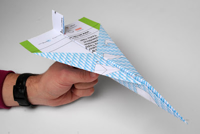
Hellenic Sonic Airlines - Company
Again a really clinical approach to a brand that is not connected to medicine at all. I love the use of pattern and shapes here to create something incredibly simplistic and clear.


No comments:
Post a Comment