Showing posts with label Brief 3 - Pitt Rivers. Show all posts
Showing posts with label Brief 3 - Pitt Rivers. Show all posts
Friday, 3 June 2011

Friday, 20 May 2011
Brief 3 - Pitt Rivers Evaluation
This project has been one of the better branding experiences I've had - though the range of deliverables was not what I originally had intended. I did want it to be more focused on promotional materials, however far more thought went into the branding than I initially intended, and so the overall focus fr the brief shifted slightly.
Conceptually -I think the branding is very appropriate, fitting with the two extra audiences I wanted to capture without alienating any of the existing museum goers. I did not manage to complete the full range of deliverables and if I could do it again I would spent just a little more time on this, and less time fine tuning the branding. However I think the branding exercise on the whole has been a useful experience, and makes me realise that I can still design around a good concept.
Conceptually -I think the branding is very appropriate, fitting with the two extra audiences I wanted to capture without alienating any of the existing museum goers. I did not manage to complete the full range of deliverables and if I could do it again I would spent just a little more time on this, and less time fine tuning the branding. However I think the branding exercise on the whole has been a useful experience, and makes me realise that I can still design around a good concept.
Wednesday, 18 May 2011


Tuesday, 17 May 2011
Brief 3 - Pitt Rivers 3D Environment
Some Photoshop mock ups of the museum signage and promo posters. I didn't want too much fuss around the main entrance, the name of the place was ll that's really necessary here, as the rest of the city's posters and signage would have all the events on them. I like the mystery that's created by having such minimal door signage, it creates excitement for the kids, and encourages people to come inside and discover rather than stand outside reading.


Monday, 16 May 2011
Brief 3 - Pitt Rivers Posters
Some feedback I had today made me realise something really fundamental missing from the logo and branding so far - and that was a small explanation of what Pitt Rivers actually is. Surely if my problem is to attract a new audience, they have to be able to know what it is straight away!
These posters hopefully adress that issue - but I feel they need a little refining. Also, I'm not sure if I'm going to go with the blank mono variation, or the photo overlays as of yet - I like them both for different reasons! But the both resonate with the idea of uncovering or discovering something. Massive typo again! Oops!


These posters hopefully adress that issue - but I feel they need a little refining. Also, I'm not sure if I'm going to go with the blank mono variation, or the photo overlays as of yet - I like them both for different reasons! But the both resonate with the idea of uncovering or discovering something. Massive typo again! Oops!


Logo variations


Sunday, 15 May 2011
Brief 3 - Pitt Rivers Visitors guide
One of the most important deliverables in this brief is the monthly newsletter/visitors guide - It kind of encompases a little bit of everything, so doesn't serve a purpose as such - but because it's monthly update it helps place the museum in the fore front of peoples minds, otherwise it would fade into the background and be forgotten.
It's also just a bit of fun to read - whilst giving the museum an opportunity to plug it's up and coming events.. I'm going to sort out that missing apostrophe right now.


It's also just a bit of fun to read - whilst giving the museum an opportunity to plug it's up and coming events.. I'm going to sort out that missing apostrophe right now.


Saturday, 14 May 2011
Brief 3 - Pitt Rivers Branding Update
Using the calendar as a starting point, I've started playing around with concepts for a visual style that will work with the logo. After talking to Lorenzo and pin pointing the idea of an 'Indian Jones/Tomb Raider' type of adventure, I started playing around with light effects to achieve a feeling of excitement.


The crash zoom effect achieves a feeling of excitement, but I couldn't help but feel it was very similar to the Science Museum - it's got an air of discovery rather than adventure.
I moved the images around a little bit and came up with this instead, which I feel fits the criteria far better. It's not too childlike or too boring, so appeals to both my target audiences - and its reminiscent of old artifacts buried underground - with the light shining on them for the first time in years. Just the right tone of voice.
I'm going refine this idea further ahead of next weeks final crit, and produce the range as well.


The crash zoom effect achieves a feeling of excitement, but I couldn't help but feel it was very similar to the Science Museum - it's got an air of discovery rather than adventure.
I moved the images around a little bit and came up with this instead, which I feel fits the criteria far better. It's not too childlike or too boring, so appeals to both my target audiences - and its reminiscent of old artifacts buried underground - with the light shining on them for the first time in years. Just the right tone of voice.
I'm going refine this idea further ahead of next weeks final crit, and produce the range as well.
Thursday, 12 May 2011
Brief 3 - Pitt Rivers Finalising logo
More logo variations
This difficulty here was trying to find a balance between the child like feeling of adventure, and the necessary academic aspect. I took inspiration for some of the museums artifacts, as well as objects like the compass to reflect the idea of discovery and exploration.


Final Logo
I'm relatively happy with this final concept - I'm happy for it to change slightly if necessary though. I like that it looks a bit dangerous, as this will appeal to everyone's sense of adventure and risk. The logo also has to be very flexible, and it would not look out of place on either a list of the lecturing professionals - or a fun fact guide for kids.

This difficulty here was trying to find a balance between the child like feeling of adventure, and the necessary academic aspect. I took inspiration for some of the museums artifacts, as well as objects like the compass to reflect the idea of discovery and exploration.


Final Logo
I'm relatively happy with this final concept - I'm happy for it to change slightly if necessary though. I like that it looks a bit dangerous, as this will appeal to everyone's sense of adventure and risk. The logo also has to be very flexible, and it would not look out of place on either a list of the lecturing professionals - or a fun fact guide for kids.

Sunday, 1 May 2011
Brief 3 - Pitt Rivers Logo Concepts
Initial Logo Concept
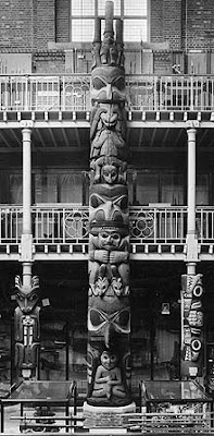
Taking inspiration from the museums key feature - a huge 11m high totem pole - I have finally began work on the new logo for the rebrand.
It was actually really useful to try and put together the calendar first - as I knew this had to be colour coded it took the pressure off choosing a colour scheme for the rest of the branding.
The totem pole has 3 spikes/people protruding from the very top and I have used this as a starting point for the logo.


 I really like all of these variations - they still need more work, as although I quite like the feeling of almost soviet era authority here, there needs to be a good level of friendliness if I want to attract a children and families.
Taking inspiration from the museums key feature - a huge 11m high totem pole - I have finally began work on the new logo for the rebrand.
It was actually really useful to try and put together the calendar first - as I knew this had to be colour coded it took the pressure off choosing a colour scheme for the rest of the branding.
The totem pole has 3 spikes/people protruding from the very top and I have used this as a starting point for the logo.


Tuesday, 26 April 2011
Brief 3 - Pitt Rivers Calendar Development
Calendar development
Really happy with the calendars so far. The hardest part and something i always struggle with was deciding on a colour scheme - This was because I wanted the calendar to be divided into sections, as well as three of the key events of the year, and obviously all the colours have to work together.. Bit of a confusing system really. But I think I've cracked it.
The 4 colours below are the 4 colours that will be used in the entire branding of the museum - they also work as a gradient, which will be useful later on.
I've going to get rid of the black text and just have it the same colour as the stock. Below I have tried two stocks and intend to try a few more - one is a pale grey and the other just plain white.. I'll probably go with an off white stock as this will best reflect the aging nature of the museums artifacts.
I decided on the 4 colours below as I wanted the colour scheme to be vibrant enough to appeal to children, but retain the regal qualities that many of its older visitors have come to love.. I also think these colours reflect the gory nature of the objects in store.


Really happy with the calendars so far. The hardest part and something i always struggle with was deciding on a colour scheme - This was because I wanted the calendar to be divided into sections, as well as three of the key events of the year, and obviously all the colours have to work together.. Bit of a confusing system really. But I think I've cracked it.
The 4 colours below are the 4 colours that will be used in the entire branding of the museum - they also work as a gradient, which will be useful later on.
I've going to get rid of the black text and just have it the same colour as the stock. Below I have tried two stocks and intend to try a few more - one is a pale grey and the other just plain white.. I'll probably go with an off white stock as this will best reflect the aging nature of the museums artifacts.
I decided on the 4 colours below as I wanted the colour scheme to be vibrant enough to appeal to children, but retain the regal qualities that many of its older visitors have come to love.. I also think these colours reflect the gory nature of the objects in store.


Subscribe to:
Posts (Atom)