So I decided to scrap the long format stuff for now. It's a really difficult format to work with anyway, and though it might work well for a calendar - it's just not practical for other publications and printed media... and I don't even want to think about how that could work across digital deliverables.
I've gone with my initial idea of a square format calendar - as it has far more potential for experimentation and is just generally a lot easier to handle (thinking of our vast and varied target audience here!).
The idea of a folding calendar touches on the interactive nature of the museum, and it means I can incorporate the square format whilst not being completely confined by it.
SINGLE SIDED CONCERTINA
12 pages, each page 100mm x 100mm - makes for a pretty long calendar once unfolded (but it can be read like a book). The benefit of this is that it encourages the user to pin it up somewhere - and keep it for the whole year. The negative is that it is a little bulky, and will almost definitely be discarded if it is not pinned up.
DOUBLE SIDED CONCERTINA
The double sided concertina requires half the paper of it's larger brother, which is a huge benefit in itself - however, it is a lot harder to navigate, it's not so likely to be pinned up and there is just as much likely hood of it being discarded.
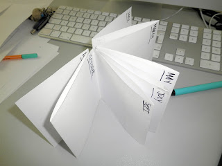
THE 'SWATCHBOOK'
This book discards the folding mechanism of the previous mock ups - and favours a more child friendly approach. It's incredibly easy to navigate and if printed on a thicker stock would be a tactile and useful item to hang on to. Also - there is the possibility of having the reverse side printed with alternative information... photographs, games for children or facts about the museum.


No comments:
Post a Comment