Showing posts with label Brief 4 - Steve Edge CV. Show all posts
Showing posts with label Brief 4 - Steve Edge CV. Show all posts
Friday, 3 June 2011

Sunday, 1 May 2011


Friday, 29 April 2011
Brief 4 - Steve Edge Evaluation
This brief has been my favourite so far. Steve has been a fantastic client - but I also think this is a reflection of my lessons learnt from previous briefs. Instead of letting the client drive me I have god ahead and produced work quickly - giving the client a selections of choices along the way, and taking on board his own ideas without them having a negative effect on my work. I have come away with a great portfolio piece, as well as a great experience.
Steve was also a pleasure to work with because of his own personal investment, as well as my own, in the project. This great to have such a personal involvement and passion for a project - and this has helped me discover something about myself and the kind of work that I enjoy most.
The project as a whole has been good fun, but in hindsight I would like to have produced more finalised work and a better range of deliverables.
Steve was also a pleasure to work with because of his own personal investment, as well as my own, in the project. This great to have such a personal involvement and passion for a project - and this has helped me discover something about myself and the kind of work that I enjoy most.
The project as a whole has been good fun, but in hindsight I would like to have produced more finalised work and a better range of deliverables.
Wednesday, 27 April 2011
Brief 4 - Finalising stationery & CV
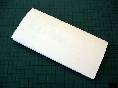
Steve Edge stationery update - I've had this done for a while now, only just had the funds to print it all on the stock I wanted and get it documented.
This is the stationery thus far - obviously it reflects the design choices I made whilst creating the CV. There are a few tweaks that I've noticed could be made now it's actually been printed, but overall I'm quite happy to take this to the crit next week.

Both variations of the CV have been printed on the same stock as the stationery - newsprint of various weights for it's obvious sustainable/recycled qualities. The publication I am still very happy with, this is still as of yet a mock up - just to test different stocks and gain peer feedback. The proper version will be printed as soon as possible.
The standard CV needs a little work as far as presentation is concerned. I designed the layout with the idea in mind that it would be stapled in the top left corner - I'm still happy with this method of binding, I just feel it needs some form of folder to package it properly... So that's the next thing on the list!
I hope to photograph these properly for my portfolio over the next week or so - so watch this space!


This is the stationery thus far - obviously it reflects the design choices I made whilst creating the CV. There are a few tweaks that I've noticed could be made now it's actually been printed, but overall I'm quite happy to take this to the crit next week.

Both variations of the CV have been printed on the same stock as the stationery - newsprint of various weights for it's obvious sustainable/recycled qualities. The publication I am still very happy with, this is still as of yet a mock up - just to test different stocks and gain peer feedback. The proper version will be printed as soon as possible.
The standard CV needs a little work as far as presentation is concerned. I designed the layout with the idea in mind that it would be stapled in the top left corner - I'm still happy with this method of binding, I just feel it needs some form of folder to package it properly... So that's the next thing on the list!
I hope to photograph these properly for my portfolio over the next week or so - so watch this space!


Tuesday, 5 April 2011
Idealismo
A2 Design
These guys did the rounds on the blogs last year, but I've dug them out again - I remembered the pattern on the back and wanted to see exactly how they made it to help me come up with a pattern for Steve's stationary.
It seems they've used A-formats as a basis for an ever expanding design based on lines and crosses, obviously a play on the name of the company - but relatively effective.
The variations I've tried so far are just a little aimless, so I'm going to try a pattern based on the grid of each piece of stationery.


These guys did the rounds on the blogs last year, but I've dug them out again - I remembered the pattern on the back and wanted to see exactly how they made it to help me come up with a pattern for Steve's stationary.
It seems they've used A-formats as a basis for an ever expanding design based on lines and crosses, obviously a play on the name of the company - but relatively effective.
The variations I've tried so far are just a little aimless, so I'm going to try a pattern based on the grid of each piece of stationery.


Brief 4 - Final Letterhead
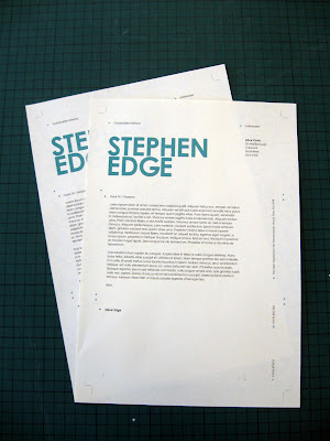
These are the finals for Steve's letterhead - and I intend to use all the elements here throughout the stationery (should be relatively quick) to tie it all together. I have been corresponding with Steve this week and will have content ready for the publication in the next few days - so this brief will be tied up by the end of the week, according to my action plan!
Development
Spent ages trying different symbols, in the end I used my own variations constructed from print symbols, like registration marks and crop marks - mixed with architectural symbols like arrows and measurements.


Finals
Might include a patterned reverse for an extra bit of interest if it's appropriate later.




Specs
Colour - Grey - 80%K / Turquoise - 75C, 0M, 31Y
Stock - Bulky Newsprint, Double sided (Print on textured side)
Development
Spent ages trying different symbols, in the end I used my own variations constructed from print symbols, like registration marks and crop marks - mixed with architectural symbols like arrows and measurements.


Finals
Might include a patterned reverse for an extra bit of interest if it's appropriate later.


Specs
Colour - Grey - 80%K / Turquoise - 75C, 0M, 31Y
Stock - Bulky Newsprint, Double sided (Print on textured side)
Monday, 4 April 2011
Brief 4 - Research
Symbols
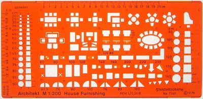
Following my last post, I've gathered imagery of symbols and technical drawings used in many different areas - print, interior/architecture, mapping, electronics, plumbing etc. I've taken some inspiration from all areas and developed my own set of symbols that I feel are appropriate for marking out the technical aspects of typography and layout within Steve's stationery.




Adaptations
Column markers
 Directional
 Grid intersection marks
 Standard crop marks
 Column marker with directional element
 I'd also like to create a geometric pattern based on these drawing for the reverse side of the stationary, and for use throughout the publication.
Following my last post, I've gathered imagery of symbols and technical drawings used in many different areas - print, interior/architecture, mapping, electronics, plumbing etc. I've taken some inspiration from all areas and developed my own set of symbols that I feel are appropriate for marking out the technical aspects of typography and layout within Steve's stationery.


Adaptations
Column markers
Subscribe to:
Posts (Atom)