Chris Triviaz - PHILAB
packaging for a range of expensive cosmetics - the design makes the brand seem like it has scientific grounding - where as cosmetics do not necessarily have to be scientifically approved. This is a technique I will definitely use for my Lacuna project.
Almo Office - Company
A range of office supplies by the studio Company, I particularly like the simplistic pattern and approach to typography here - though it's for printer toner cartridges, there is a clinical feeling to the general design.
Hellenic Sonic Airlines - Company
Again a really clinical approach to a brand that is not connected to medicine at all. I love the use of pattern and shapes here to create something incredibly simplistic and clear.
Showing posts with label OUGD303dc. Show all posts
Friday, 29 April 2011
Brief 5 - Lacuna Inc. Packaging Research
Wednesday, 27 April 2011
Brief 5 - Lacuna Inc. Medical packaging
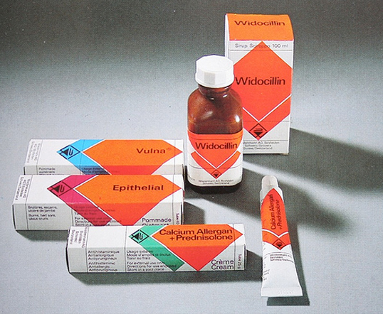
Vintage packaging
Packaging by Garry Emery of Emery Vincent studios http://www.emerystudio.com/es_flash.htm
Love the simple colours and shapes, even though it have a vitange look - the design is relatively modern, something like this might work for the Lacuna brief.. I think the brand I'm working on needs another dimension to it, like a pattern or set format.
Modern Medical Packaging
I like these packages for the meaning behind the size, colour and width of the shapes involved. They each indicated strength of dose, type of medicine and the amount - but it could maybe have be executed a little better. Great idea though!
Packaging by Garry Emery of Emery Vincent studios http://www.emerystudio.com/es_flash.htm
Love the simple colours and shapes, even though it have a vitange look - the design is relatively modern, something like this might work for the Lacuna brief.. I think the brand I'm working on needs another dimension to it, like a pattern or set format.
Modern Medical Packaging
I like these packages for the meaning behind the size, colour and width of the shapes involved. They each indicated strength of dose, type of medicine and the amount - but it could maybe have be executed a little better. Great idea though!
Brief 5 - Lacuna Inc. Research
Thursday, 14 April 2011
Brief 3 - Pitt Rivers Research
Another interesting take on branding for an events guide -
The more I look into this, the more photography seems to be unavoidable..
Anyway, the thing that caught my eye here was the way they have integrated the 'logo'/red circle into a 3d space by making it a sphere. This is now less about branding for an events guide, and more about environmental/spacial graphic design.. I like the cross over anyway.
The more I look into this, the more photography seems to be unavoidable..
Anyway, the thing that caught my eye here was the way they have integrated the 'logo'/red circle into a 3d space by making it a sphere. This is now less about branding for an events guide, and more about environmental/spacial graphic design.. I like the cross over anyway.
Tuesday, 12 April 2011
Brief 3 - Pitt Rivers Research
Just trying to get my head round the Pitt Rivers brief -
I want to try and stay away from the standard process of coming up with a logo and applying it to a range. My aim here is to see if there is a better way of coming up with a brand, or if approaching it from a different angle will have a more interesting or original result.
So, I'm starting with the development of a calendar - the calendar will have 3 one off events throught the year, design to attract 3 new target audiences - as well as a range of recurring monthly events.
The 3 events will need to have their own identity as they are so different - but they will also need to reflect the overarching brand of the museum.
This seemed like a massively daunting task at first - but looking around it's really quite easy to maintain the 'feeling' of a brand that promotes very different events.
This magazine produced by ICON is a great example of this. The magazine promotes and guides you through a spectrum of different design styles and art work - but you are reminded of its brand through the simple use of colour. The use of photography means that everything has a similar feel throughout - combined with the appearence of the yellow balloon and random intervals keep the brand in tact, whilst allowing for a huge amount of flexibility with regards to content.
See the whole thing here: http://www.media-ten.com/3dissue/icon/designtrail/2010/
I want to try and stay away from the standard process of coming up with a logo and applying it to a range. My aim here is to see if there is a better way of coming up with a brand, or if approaching it from a different angle will have a more interesting or original result.
So, I'm starting with the development of a calendar - the calendar will have 3 one off events throught the year, design to attract 3 new target audiences - as well as a range of recurring monthly events.
The 3 events will need to have their own identity as they are so different - but they will also need to reflect the overarching brand of the museum.
This seemed like a massively daunting task at first - but looking around it's really quite easy to maintain the 'feeling' of a brand that promotes very different events.
This magazine produced by ICON is a great example of this. The magazine promotes and guides you through a spectrum of different design styles and art work - but you are reminded of its brand through the simple use of colour. The use of photography means that everything has a similar feel throughout - combined with the appearence of the yellow balloon and random intervals keep the brand in tact, whilst allowing for a huge amount of flexibility with regards to content.
See the whole thing here: http://www.media-ten.com/3dissue/icon/designtrail/2010/
Sunday, 10 April 2011
Mike Reed
Was just finally sorting my Behance account out - and I had a quick trawl through the branding section, there's some great stuff on there - but I thought I'd repost this just because it made me laugh! 'Bout time someone took the piss out of this trend eh?
You can see the rest of the project here.
Tuesday, 5 April 2011
Idealismo
A2 Design
These guys did the rounds on the blogs last year, but I've dug them out again - I remembered the pattern on the back and wanted to see exactly how they made it to help me come up with a pattern for Steve's stationary.
It seems they've used A-formats as a basis for an ever expanding design based on lines and crosses, obviously a play on the name of the company - but relatively effective.
The variations I've tried so far are just a little aimless, so I'm going to try a pattern based on the grid of each piece of stationery.
These guys did the rounds on the blogs last year, but I've dug them out again - I remembered the pattern on the back and wanted to see exactly how they made it to help me come up with a pattern for Steve's stationary.
It seems they've used A-formats as a basis for an ever expanding design based on lines and crosses, obviously a play on the name of the company - but relatively effective.
The variations I've tried so far are just a little aimless, so I'm going to try a pattern based on the grid of each piece of stationery.
Monday, 4 April 2011
Brief 4 - Research
Symbols
Following my last post, I've gathered imagery of symbols and technical drawings used in many different areas - print, interior/architecture, mapping, electronics, plumbing etc. I've taken some inspiration from all areas and developed my own set of symbols that I feel are appropriate for marking out the technical aspects of typography and layout within Steve's stationery.
Adaptations
Column markers
Directional
Grid intersection marks
Standard crop marks
Column marker with directional element
I'd also like to create a geometric pattern based on these drawing for the reverse side of the stationary, and for use throughout the publication.
Following my last post, I've gathered imagery of symbols and technical drawings used in many different areas - print, interior/architecture, mapping, electronics, plumbing etc. I've taken some inspiration from all areas and developed my own set of symbols that I feel are appropriate for marking out the technical aspects of typography and layout within Steve's stationery.
Adaptations
Column markers
Directional
Grid intersection marks
Standard crop marks
Column marker with directional element
I'd also like to create a geometric pattern based on these drawing for the reverse side of the stationary, and for use throughout the publication.
Subscribe to:
Posts (Atom)