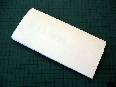
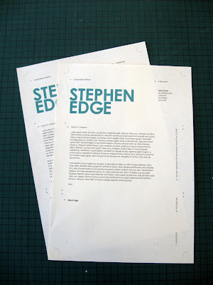
These are the finals for Steve's letterhead - and I intend to use all the elements here throughout the stationery (should be relatively quick) to tie it all together. I have been corresponding with Steve this week and will have content ready for the publication in the next few days - so this brief will be tied up by the end of the week, according to my action plan!
Development
Spent ages trying different symbols, in the end I used my own variations constructed from print symbols, like registration marks and crop marks - mixed with architectural symbols like arrows and measurements.
Finals
Might include a patterned reverse for an extra bit of interest if it's appropriate later.
Specs
Colour - Grey - 80%K / Turquoise - 75C, 0M, 31Y
Stock - Bulky Newsprint, Double sided (Print on textured side)


No comments:
Post a Comment