Initial Logo Concept
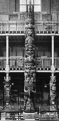
Taking inspiration from the museums key feature - a huge 11m high totem pole - I have finally began work on the new logo for the rebrand.
It was actually really useful to try and put together the calendar first - as I knew this had to be colour coded it took the pressure off choosing a colour scheme for the rest of the branding.
The totem pole has 3 spikes/people protruding from the very top and I have used this as a starting point for the logo.
I really like all of these variations - they still need more work, as although I quite like the feeling of almost soviet era authority here, there needs to be a good level of friendliness if I want to attract a children and families.


No comments:
Post a Comment