Monday, 28 March 2011

Graphic design / Interior Design

My last post got me thinking about part of the rationale I wrote a while ago - talking about design for environments..
The stuff I'm doing for Steve has also reminded me just how interwoven graphic design and interior space are. Perhaps I do the stationary for a new office space in the future? Naturally they are going to want their interior to reflect the brand of their printed media..
Anyway - here's a few agencies I found who specialise in the whole package - digital, print and environment.

This kind of design for interior space may form a chapter or section of my context book.

Both of these examples show how type and image can be applied to a 3-dimensional space to expand the identity of a business. There are many more things to consider when designing at this scale - obviously production costs are higher, meaning there is less room for error, and therefore more planning involved. 

Absolute 
Carbis Bay Dentists
 
Pizza Express
Kancho Creative 
The Hairy Lemon 

A fantastic example of how a brand can work across print, web and the actual bar space itself.
  

Friday, 25 March 2011

Brief 4 - Steve C.V Research

A few screen grabs from various websites in Steve's field - Graphic design and interior space kind of go hand in hand, therefore a lot of these websites have the same clean cut feel that a lot of design studios have adopted. There's loads of room for creativity, however there is a certain level of traditional prestige associated with this sector - some of these builds have cost a lot of money..

Obviously Steve's connections with sustainability will have an impact on the final direction - however there is a risk of cheapening him as a designer by going with recycled stocks and aesthetics. Something to consider anyway.

John Evans - Birmingham


Keppie - Glasgow


Artillery - London, Melbourne & Dubai

Jestico + Whiles - London & Prague

Barnes - London

Brief 4 - Steve C.V Standard Layout

Obviously the initial brief called for a standard printable CV for the client to distribute via the web and hardcopies.

I went with the same layout from direction 3 shown in my previous post - as this is the one I'm most likely to develop as the brief continues.

Development

Brief 4 - Steve C.V Publications

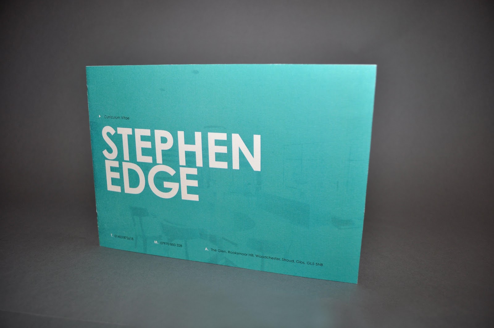
These are the printed versions of the cv publications from Wednesday's crit. Overall feedback was that it felt too corporate for a creative alternative to a standard CV, given that Steve works in the creative industry. I both agree and disagree with this statement - as this industry calls for a relatively corporate feel, but I definitely could be more adventurous..

I' pretty happy with how direction 3 is panning out.. I'm going to produce a range of stationery to go with each publication before choosing one to apply across a range.

Direction 1
Lime green & 50%Key on Sugar Paper


Direction 2
Orange & 80%Key on White Card


Direction 3
Turquoise & 75%Key on Bulky Newsprint - With a card cover.


Thursday, 24 March 2011

Brief 4 - Steve C.V Layout Tests

Along with the publication and other deliverables for this brief - I have to fulfill the original request for a traditional A4 C.V.
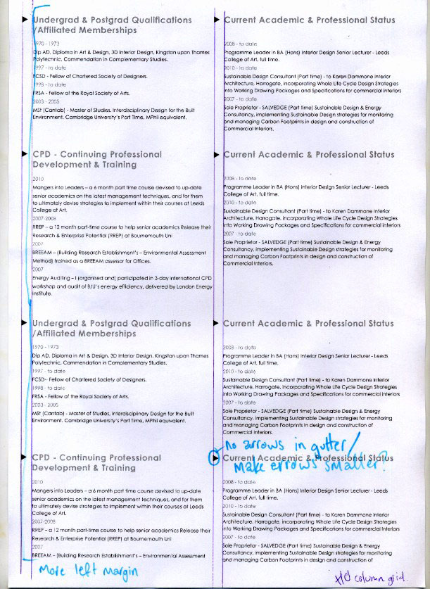
However there is a lot of information to work through, so a good amount of consideration regarding the grid and column system is needed. I always like to print out the test pieces as these things never look the same on screen as they do on paper - and it allows me to make notes and alterations by hand.


We have a winner!
Needs a bit of adjustment - the left hand margin is perhaps a bit extreme - trying to get a balance of information on the page vs readability is pretty difficult. On the one hand, white space makes everything easier to digest, and on the other - this C.V can't run over 20 pages... that'd just be ridiculous.

Brief 3 - Pitt Rivers Initial Concept

The branding for this brief is going to center around the creation of a calendar of events. The design of the calendar will dictate how each individual event will look and the eventual range of products needed, i.e signage, leaflets, online resources..

Initially I would like the creation of the calendar to be designed with format in mind - however, there must be a consideration of context. Pitt Rivers Museum is public funded, and therefore there is also an emphasis on price and overall feasibility.

Long Format
These initial ideas are experiments to see how the calendar would be catagorised - either by type choice, colour or size... by month or by event? These are all problems that need to be worked out first, as they will have a huge impact on the design.


Brief 3 - Pitt Rivers Research

The format of the inital calendar will drive the branding and format for the rest of the Pitt Rivers branding. So it seems natural to have a quick look at some of the calendar formats out there.
Obviously I will have to consider each target audience when designing the calendar - it must be easy to understand by both children and the older audiences that the museum already has.

Calendar by Sander Tielen of Studio Kluif
A really technical/digital approach to this calendar, the use of simple numerals means that this calendar can be understood internationally. 

Circular Formats
Interesting formats but potentially quite difficult to understand as it relies on small scale type.


Square Format
The use of squares could be echoed through the Pitt Rivers design as well as the format - the large and familiar shape of this calendar makes it easy to understand and allows people to absorb a fairly large amount of information easily.

Publication - Manuel Dall'olio
The calendar can easily be incorporated into a publication or book format for visitors to take away. This actual design of the calendar is interesting as well - the format is original as well as easy to make sense of. I'm obviously dubious about being too experimental with a calendar, as it's main objective it to convey information quickly and simply.