Thursday, 12 May 2011

Brief 3 - Pitt Rivers Finalising logo

More logo variations
This difficulty here was trying to find a balance between the child like feeling of adventure, and the necessary academic aspect. I took inspiration for some of the museums artifacts, as well as objects like the compass to reflect the idea of discovery and exploration.

Final Logo
I'm relatively happy with this final concept - I'm happy for it to change slightly if necessary though. I like that it looks a bit dangerous, as this will appeal to everyone's sense of adventure and risk. The logo also has to be very flexible, and it would not look out of place on either a list of the lecturing professionals - or a fun fact guide for kids.

Tuesday, 10 May 2011

Design Context Books - Mock up spreads

Still trying to figure out a good way of categorising the areas of branding I'm looking at - I've always had some kind of focus on the culture sector - so I figure that's the best place to start.

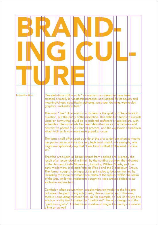
Here are a few spread mock ups anyway - Just playing with context and layout at this stage.

Monday, 2 May 2011

Brief 5 - Lacuna Inc. Cellular Patterns

The medical procedure that Lacuna Inc offer is based on the erasure of cells in the bran that carry particular memories - therefore it seems natural for the next addition to the brand to be based upon the idea of a celular structure, perhaps with pieces missing.

I particularly like the last four designs here, the second one being a trace of an actual brain cell - I will possibly use both if I can combine them well enough.

Sunday, 1 May 2011

Brief 4 - Steve Edge Finals

Stationery


Standard CV


Publication CV

Brief 5 - Lacuna Inc. Logo Colourways

A few colourways for the Lacuna Logo - I particularly like the pastel shades for suggesting medical/clinical-ness, but I want this company to have a slightly uncomfortable/mysterious feel at the same time. This is going to be a difficult one!

Brief 3 - Pitt Rivers Logo Concepts

Initial Logo Concept
Taking inspiration from the museums key feature - a huge 11m high totem pole - I have finally began work on the new logo for the rebrand.

It was actually really useful to try and put together the calendar first - as I knew this had to be colour coded it took the pressure off choosing a colour scheme for the rest of the branding.

The totem pole has 3 spikes/people protruding from the very top and I have used this as a starting point for the logo.


I really like all of these variations - they still need more work, as although I quite like the feeling of almost soviet era authority here, there needs to be a good level of friendliness if I want to attract a children and families.