Development for direction 3
Wednesday, 30 March 2011
Brief 4 - Direction 3, Letterhead.
Brief 2 - KTP - Evaluation
The first half of the year has got off to a slow start. The projects I'm working on are all live briefs and after a few tutorials I've realised a lot of my briefs don't allow me to full exploit my rationale. My desire to work with clients has given me a huge amount of experience in dealing with other people and finding a compromise between my own ideas and theirs - however this as left me with a compromised portfolio, and less time to do something about it. This brief in itself has been quite slow - and at first I wanted to blame things with the client, as there were problems with budget and the KTP package didn't end up going to print. There was also a lack of copy to put in the brochures, another reason I felt I couldn't carry on with the brief.
Looking back I realise it was my own fault I didn't resolve this brief quicker - Its my job as a designer to produce the work and it would have been very easy to take things into my own hands instead of letting other issues hold me back. This has been a very valuable lesson. You can't always waste for the client to tell you what they want - to a certain extent you just have to give them it.
Tuesday, 29 March 2011
Brief 4 - Direction 2, Compliment Slip.
Compliment Slip layout development based on direction 2.
Development
Front
Happy with the layout below - didn't need as much tweaking as the previous compliment slip - the choices I'd made for the letterhead transitioned quite nicely into a new format.
Back
Development
Front
Happy with the layout below - didn't need as much tweaking as the previous compliment slip - the choices I'd made for the letterhead transitioned quite nicely into a new format.
Back
Brief 4 - Direction 2, Letterhead.
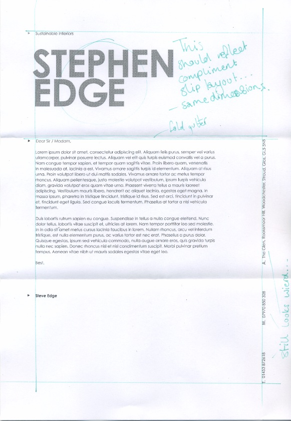
Letterhead layout development using direction 2, as part of Steve's range of stationary.
Development
Development
Going with the layout below. I divided the page into 3 sections so that the folds do not interfere with the text.
Brief 4 - Direction 1, Business Card.
Pending.
Brief 4 - Direction 1, Compliment Slip.
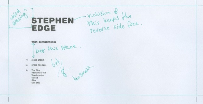
Compliment slip layout tests for the first design direction - made to mimic the letterhead as much as possible.
Front -
Front -
Going with the layout below for the compliment slip. It's been completely re-adjusted to fit the new format, but still echos the letterhead well.
Back -
I was going to go with something like this for the reverse of the compliment slip - but it just doesn't work with the type, and cheapens what is already quite an immature looking design. I'm going have either a blank reverse (given it's printed on sugar paper - should look okay) or something very small just to add a bit of interest.
Breif 4 - Direction 1, Letterhead.
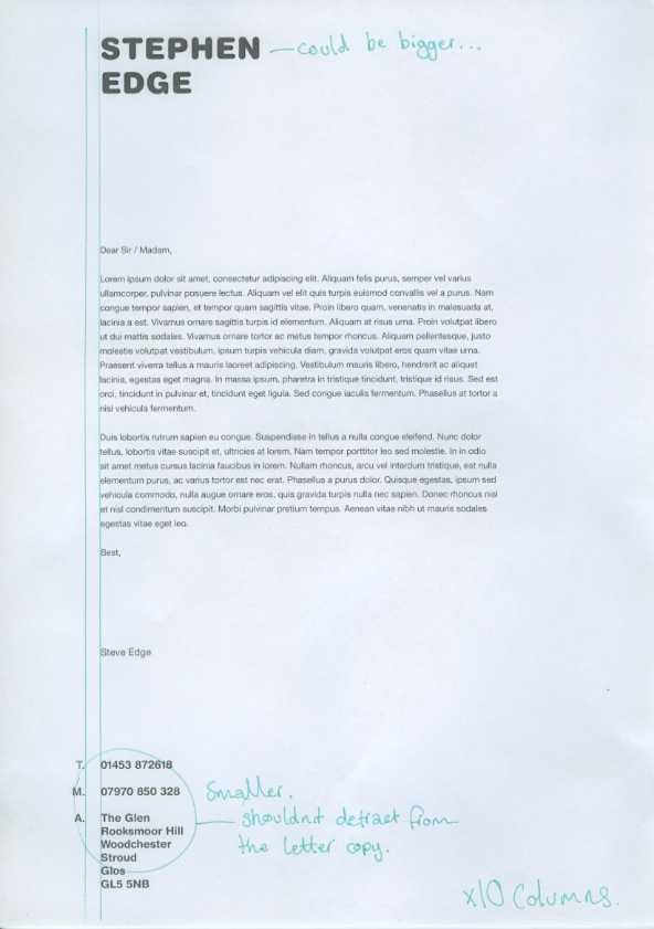
Development and resolution for a letterhead based on the first design direction.
Development
Decided to go with the one below for a few reasons. I didn't really want to use the gradient for the logo heading, but I the only other choice was 50%K and that just left the whole thing feeling messy and unbalanced. I went for standard Helvetica for the copy as this still fits with the rounded version I initially used.
Development
Decided to go with the one below for a few reasons. I didn't really want to use the gradient for the logo heading, but I the only other choice was 50%K and that just left the whole thing feeling messy and unbalanced. I went for standard Helvetica for the copy as this still fits with the rounded version I initially used.
Subscribe to:
Posts (Atom)